4. Dashboards#
Metrics provide real-time visibility into the system’s health, but they are also crucial for retrospective analysis — understanding what went wrong days ago, or identifying when a workload pattern started changing.
The challenge is that you rarely know in advance which metrics will be useful during a future incident. For this reason, we recommend continuously collecting a baseline set of metrics that are useful for both operational monitoring and post-incident diagnostics.
This section highlights key metrics that we believe should be visualized and tracked on all production clusters. Each chart comes with a recommended interpretation and the metric identifiers involved.
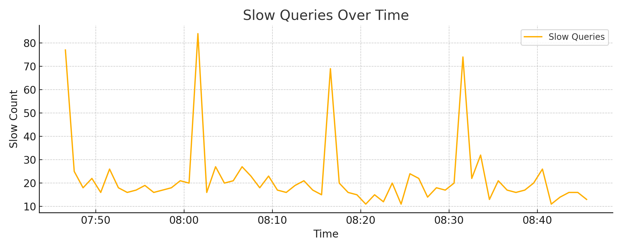
4.1. Slow Queries Over Time#
A sustained increase in slow queries often indicates a latent performance issue: I/O bottlenecks, cache exhaustion, or shifts in query shape. Short spikes may align with ingestion bursts, backups, or temporary compaction load.
Metrics used:
requests.slow_count— number of slow queries, per sampling interval
Interpretation:
Occasional spikes can be normal under load
Frequent or sustained increases suggest a need to investigate disk I/O, memory, or query behavior
Example chart:
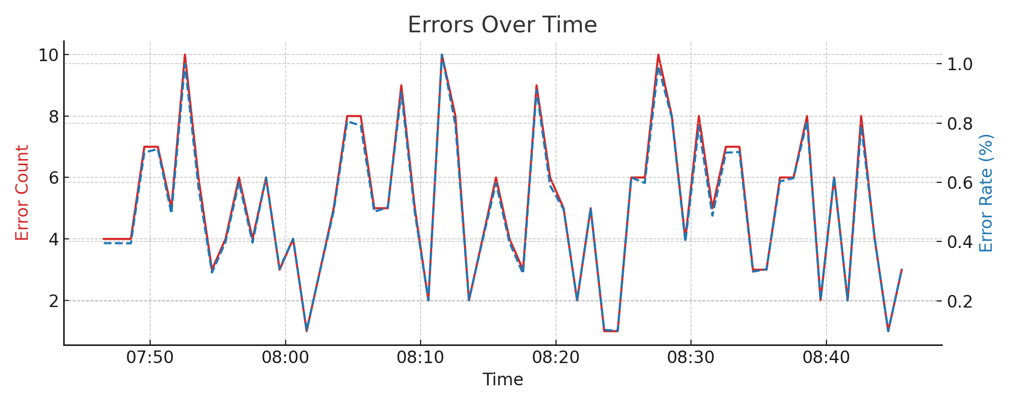
4.2. Error Count and Rate#
Errors often increase during deployment rollouts, schema changes, or when invalid queries are being sent by clients. However, an increasing error count is not always a problem — especially if traffic is increasing too. A rising error rate, on the other hand, typically signals regressions or misconfiguration.
Metrics used:
requests.total_countrequests.successes_countDerived: -
error_count = total_count - successes_count-error_rate = 100 * error_count / total_count
Interpretation:
High count but low rate = expected under load
Rising rate = often indicates a functional issue
Example chart:
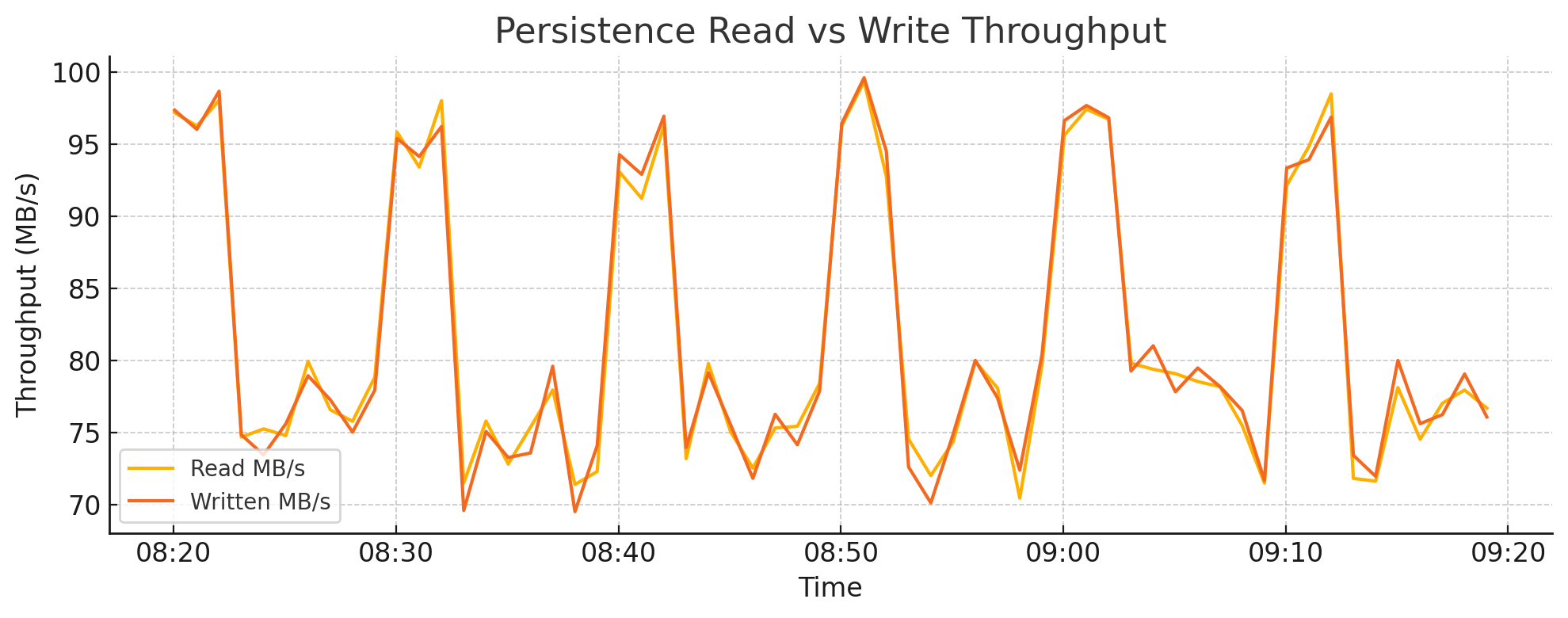
4.3. Persistence Read vs Write Throughput#
Backend I/O activity is a critical signal for detecting compaction stress, ingestion surges, or inefficient data layout. Tracking read and write throughput at the storage layer can help distinguish between healthy ingestion patterns and high write amplification.
Metrics used:
persistence.read_bytespersistence.written_bytesDisplayed in megabytes per second (MB/s)
Interpretation:
Sustained high write throughput may indicate aggressive compaction or frequent updates to existing shards
Read spikes can align with query bursts, backfill processes, or remote storage reads
Sudden write drops may indicate ingestion failures or disk-level backpressure
Example chart:

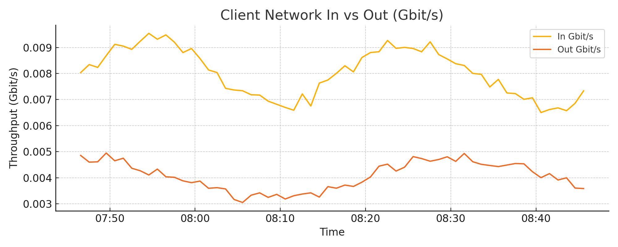
4.4. Client Network In vs Out (Gbit/s)#
By comparing client I/O with total system-level network metrics, you can estimate how much traffic is due to backend storage (e.g., S3 or disk caching). A low client I/O but high total I/O typically indicates compaction activity or backend overhead.
Metrics used:
requests.in_bytesrequests.out_bytesDisplayed in Gigabits per second (Gbit/s)
Interpretation:
Sudden increases in I/O should be correlated with ingestion and compaction metrics
Gaps between client I/O and total system I/O highlight backend-heavy operations
Example chart:
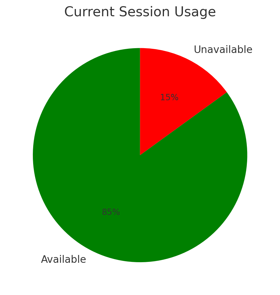
4.5. Session Monitoring#
The QuasarDB server allocates a fixed number of client sessions based on the configuration file. Each session represents an active connection from a client to the cluster. Once a client disconnects, the session becomes available again — either immediately or after a configured timeout.
When client code does not explicitly close connections, sessions may remain in use longer than necessary. For this reason, we recommend that users keep client-side connections short-lived and always close them properly.
If all sessions are marked as unavailable, new clients will be unable to connect to the cluster. This surfaces as connection errors, timeouts, or failed operations depending on the client behavior.
Metrics used:
network.sessions.available_countnetwork.sessions.unavailable_count
These metrics are gauges and reflect real-time status.
4.5.1. Current Usage#
A pie chart gives a fast visual impression of current session load. This is useful for checking whether the system is nearing exhaustion of available sessions.
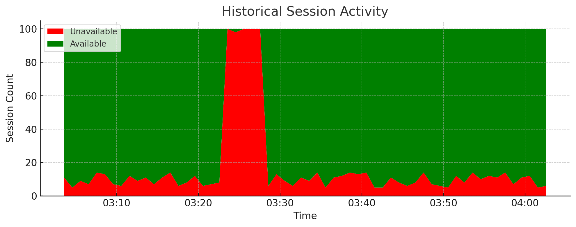
4.5.2. Historical Session Activity#
A stacked area chart allows you to observe session trends over time and identify problematic patterns. For example, a periodic spike in unavailable sessions may indicate an automated script that opens many long-lived connections without closing them.
This type of visualization is useful for diagnosing transient outages or instability. If all sessions are marked as unavailable, clients may be temporarily unable to connect.
4.6. Ingestion Throughput by Bucket Operation#
Understanding the breakdown of ingestion operations is essential when diagnosing high disk I/O or compaction pressure. A high number of updates per minute often indicates an anti-pattern where clients perform incremental writes into existing shards, which increases write amplification and fragmentation.
Monitoring the volume of inserts vs. updates vs. reads helps guide both performance tuning and data model optimization.
Metrics used:
persistence.bucket_read_countpersistence.bucket_insert_countpersistence.bucket_update_countpersistence.bucket_deletion_count
Interpretation:
Inserts should typically dominate — high update counts may signal inefficient ingestion patterns
Spikes in deletion count are often correlated with schema-level TTL or cleanup processes
Compare these trends with requests.in_bytes to contextualize ingestion volume
Example chart:
4.7. Async Pipelines#
Async pipelines are server-side buffers used to batch incoming writes before they are committed to disk. This mechanism is particularly useful for high-frequency ingestion workloads, as it reduces the number of incremental shard updates by merging many writes into a single operation.
For a more in-depth explanation of how async pipelines work, see: Async Pipelines
Note
The metrics below are only relevant if you’re actively using async pipelines. If you’re not pushing data using the async ingestion API, these charts will remain flat.
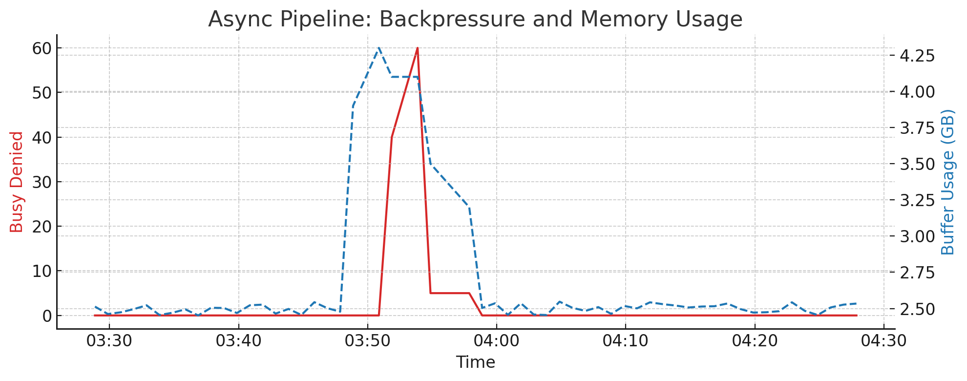
4.7.1. Write Rejections (Backpressure)#
When an async pipeline is full, incoming data will be rejected. This is typically due to memory pressure or slow downstream I/O (e.g. the flush operation can’t keep up).
Metric used:
async_pipelines.busy_denied_count
Interpretation:
Spikes indicate the buffer is full, and clients are unable to enqueue new writes
Frequently correlates with high async_pipelines.buffer.total_bytes or slow write pressure
Can lead to ingestion lag or partial data loss (if the client doesn’t retry)
4.7.2. Memory Usage and Backpressure Correlation#
This metric indicates how much memory is actively used by all async pipelines combined. If memory usage reaches the configured threshold (e.g. 4 GB per pipeline), new writes may be denied until a flush occurs.
Metrics used:
async_pipelines.buffer.total_bytes
Interpretation:
Should normally fluctuate below the maximum allocation
Sustained high values suggest insufficient flush throughput or aggressive ingestion rate
Correlate spikes with
busy_denied_countto detect memory pressure
Example chart:
4.7.3. Write Performance and Failures#
These metrics reflect how much data is written to disk by the async pipelines, how long it takes, and whether any errors occurred. Failures should be extremely rare and generally indicate low-level storage issues, such as a full disk or filesystem errors.
Metrics used:
async_pipelines.write.bytes_totalasync_pipelines.write.elapsed_usasync_pipelines.write.successes_countasync_pipelines.write.failures_count.total
Interpretation:
Regular flush patterns (e.g. every 5 minutes) are normal
Elapsed time spikes may correlate with slow queries or compaction events
Non-zero failure counts should be investigated immediately
Example chart:
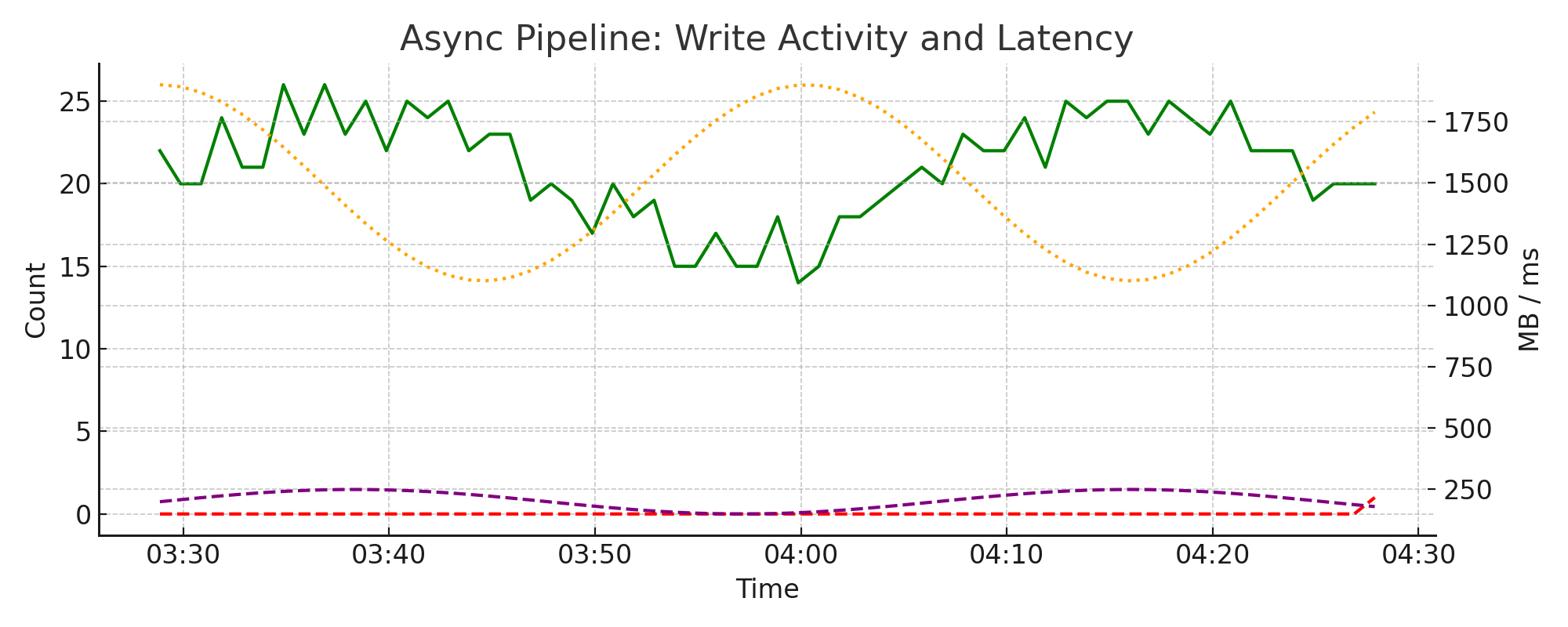
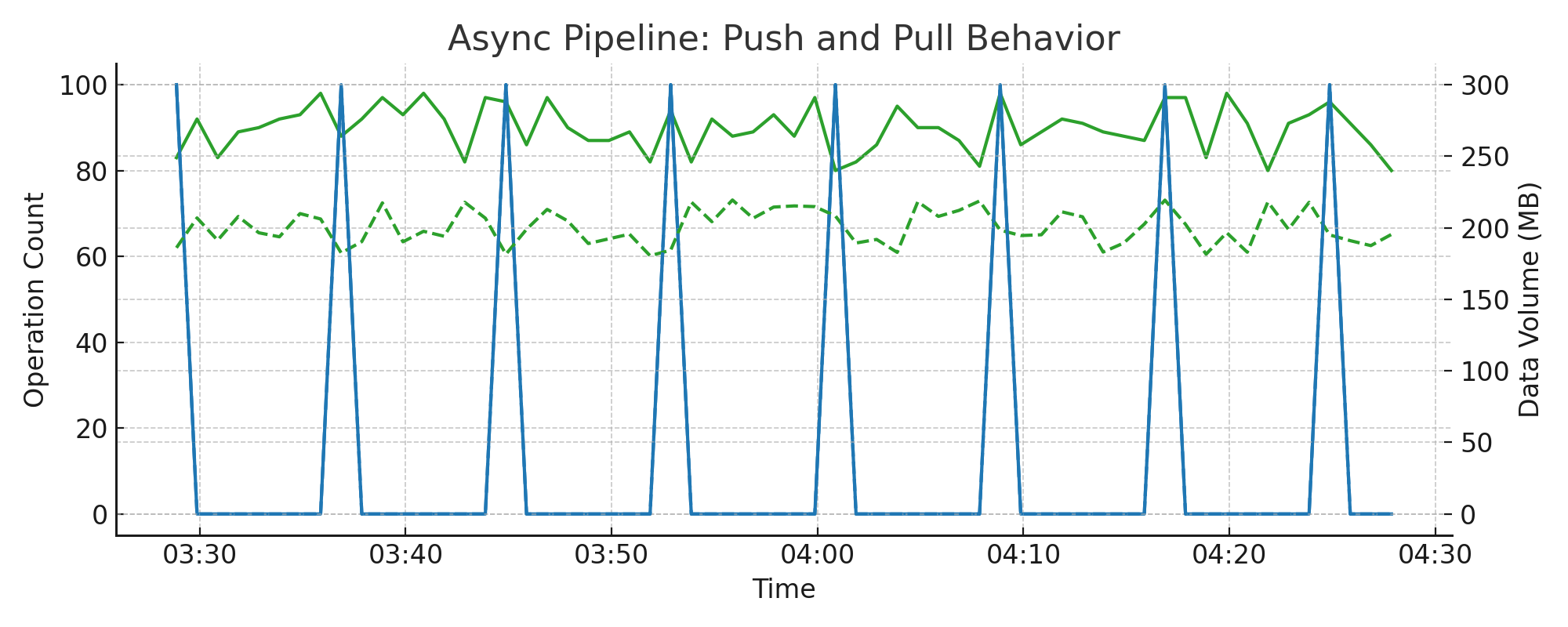
4.7.4. Push and Pull Behavior#
These metrics describe the flow of data through the async pipeline: how clients push data in, and how the system periodically pulls it for merging and writing.
Metrics used:
async_pipelines.pushed.total_bytesasync_pipelines.pushed.total_countasync_pipelines.pulled.total_bytesasync_pipelines.pulled.total_count
Interpretation:
Push operations from clients should form a consistent flow
Pull operations are periodic and align with the async flush interval (adjusted for parallelism)
If using 8 pipelines with a 5-minute flush interval, expect pull spikes roughly every 40 seconds
Useful for correlating ingestion phases with disk I/O pressure
Example chart:
4.8. Cache Behavior and Evictions#
Understanding cache behavior is critical to diagnosing performance issues in QuasarDB. Because cache churn directly affects query speed, even small changes in configuration (e.g., a few GB more cache) can have dramatic effects on performance and eviction rates.
This section highlights key cache metrics and interprets their impact on cluster behavior.
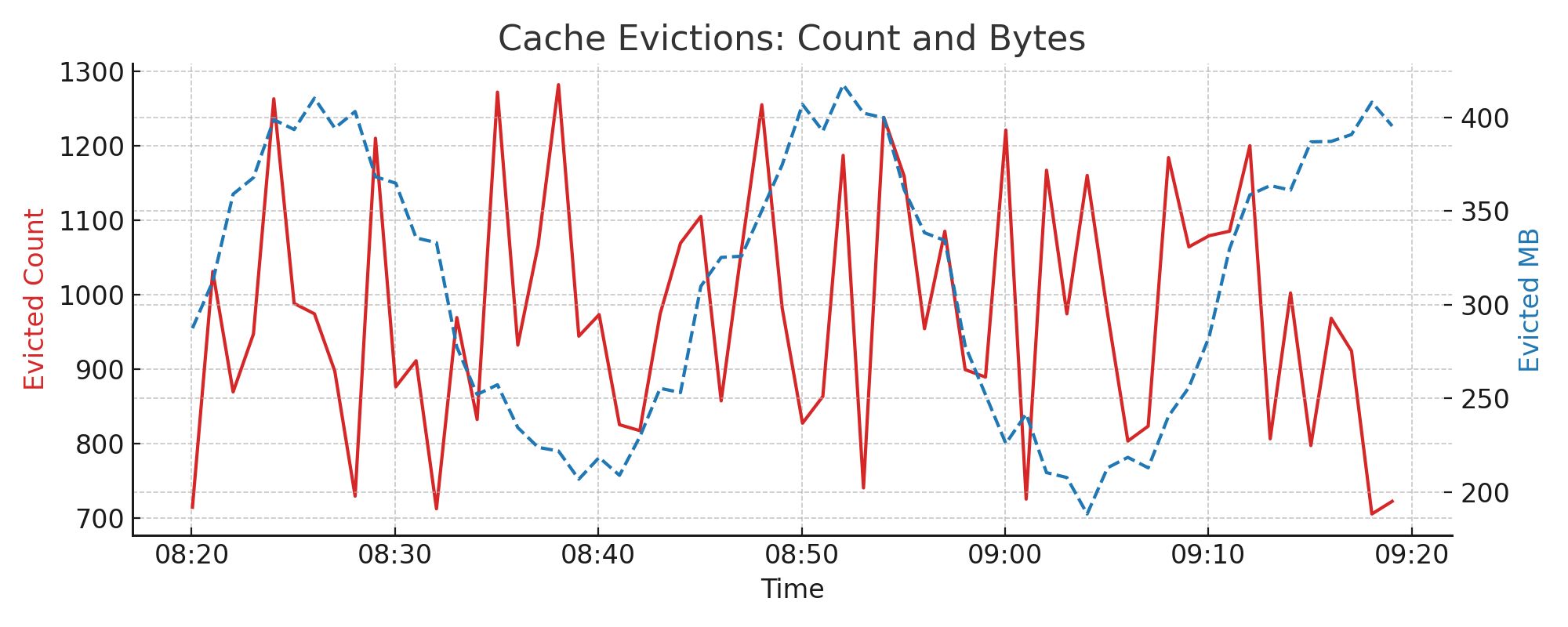
4.9. Cache Evictions: Count and Size#
Cache evictions occur when memory pressure forces the system to remove cached items. Eviction count and volume help you measure churn in the cache layer. High eviction rates suggest that cache is undersized or data is not being reused efficiently.
Metrics used:
evicted.countevicted.total_bytes
Interpretation:
A spike in evictions usually correlates with query or ingestion surges
A sustained high level indicates potential cache undersizing or poor temporal locality
Example chart:
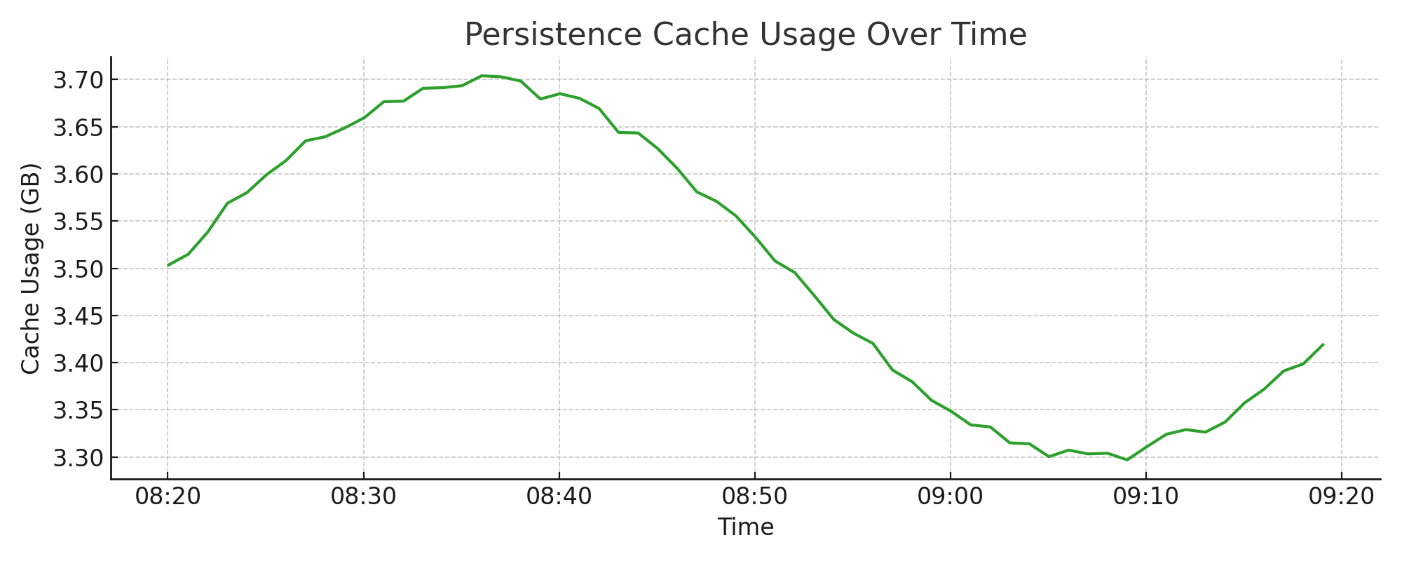
4.10. Persistence Cache Usage#
This metric represents the memory used by the persistence/storage layer. While it includes part of the cache, it’s distinct from the LRU2 hot/cold cache mechanism.
Metrics used:
memory.persistence.total_bytes
Interpretation:
Should remain relatively stable under normal workloads
If usage approaches system memory limits, it can result in eviction spikes or swap
Example chart:
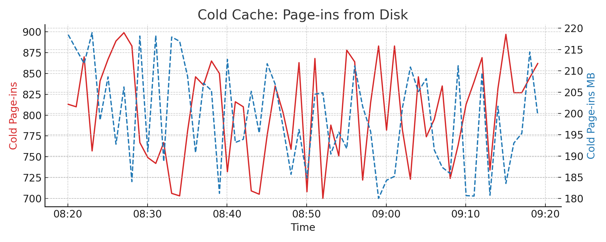
4.11. LRU2 Cache: Page-ins from Disk#
Page-ins occur when blocks are loaded into the cold cache directly from disk. This chart reflects cache misses and shows the rate at which new entries enter the LRU2 system.
Metrics used:
lru2.cold.pagein.countlru2.cold.pagein.total_bytes
Interpretation:
Spikes often correlate with query bursts accessing uncached data
Sustained high values may indicate insufficient cache warm-up or fragmentation
Example chart:
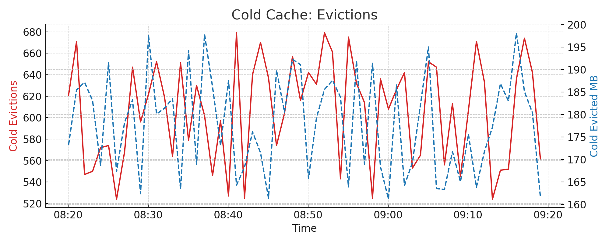
4.12. LRU2 Cache: Cold Evictions#
If the cold cache fills up, older or least-used entries are evicted. Tracking both count and byte volume gives insight into how much data is lost from cache.
Metrics used:
lru2.cold.evicted.countlru2.cold.evicted.total_bytes
Interpretation:
High eviction rates suggest insufficient cold cache size
Can indicate poor cache reuse or bursty access patterns
Example chart:
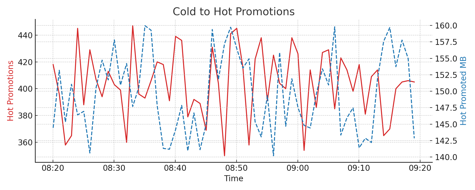
4.13. LRU2 Cache: Promotions to Hot#
Entries accessed frequently in the cold cache are promoted to the hot cache, which has a higher probability of reuse. This flow is essential for tuning LRU2 efficiency.
Metrics used:
lru2.hot.promoted.countlru2.hot.promoted.total_bytes
Interpretation:
Promotions indicate successful reuse and cache effectiveness
Low promotion counts may suggest working set exceeds cold cache size
Example chart:
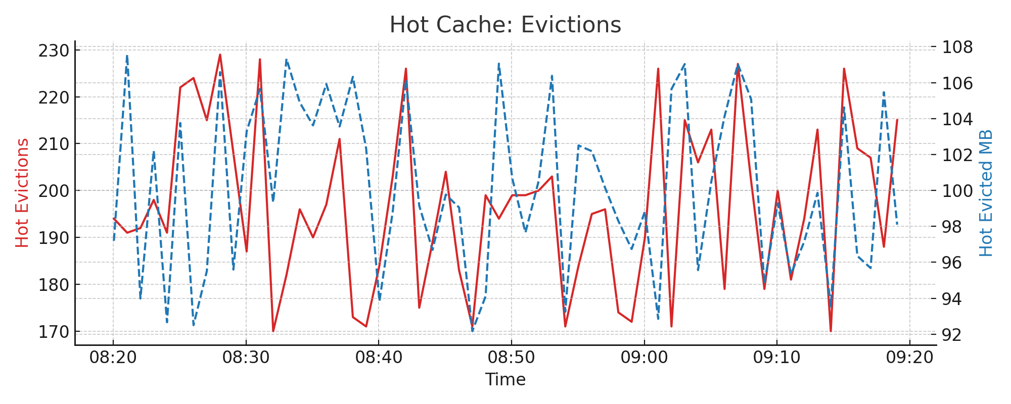
4.14. LRU2 Cache: Hot Evictions#
Evictions from the hot cache typically occur when it’s full and new promoted entries arrive. This should be rare under well-tuned cache conditions.
Metrics used:
lru2.hot.evicted.countlru2.hot.evicted.total_bytes
Interpretation:
Frequent hot cache evictions usually point to insufficient total cache
Can degrade performance significantly, especially for repeat queries
Example chart:
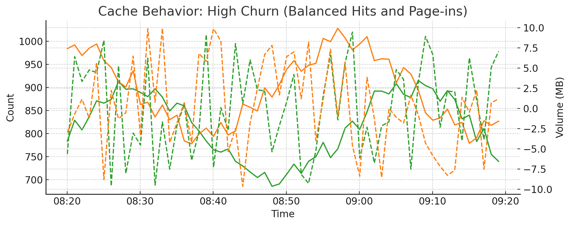
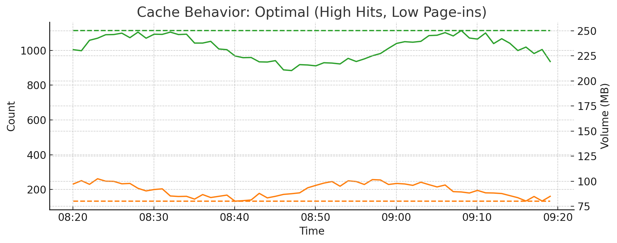
4.15. Cache Efficiency: Hot Hits vs Cold Page-ins#
The balance between hot cache hits and cold cache page-ins reflects how efficiently the system reuses recently accessed data. These charts help evaluate cache tuning and workload behavior.
Metrics used:
lru2.hot.hit.countlru2.hot.hit.total_byteslru2.cold.pagein.countlru2.cold.pagein.total_bytes
Interpretation:
When the working set fits in memory, most accesses hit the hot cache
High cold page-ins often mean queries are touching uncached or historical data
An imbalance may indicate under-provisioned cache or shifts in query patterns
Optimal Cache Behavior:
High Churn Scenario: